Conclusion and evaluation
Conclusion and
evaluation
Finally we will conclude the project and discuss some of the challenges we faced.
Conclusion
Conclusion
In conclusion to our project for Design with Specific Users, we have come to our final product the TagTracker. We have come to this final product by really getting to know our participant Joe. We have interviewed him in order to get a better understanding in his day-to-day life and see where he encounters any troubles. As our participant has been blind since birth he has quite a lot already figured out. This is way a little more digging was needed inorder to come to the right problem direction. What ended up being with this clothing. Here it was really hard for him to indicate the newness of his shirts. So this was the problem we started working with.
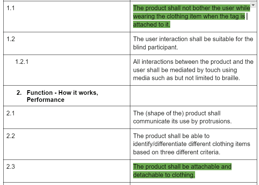
A lot of different sessions like meeting him in person and calling were used to come to the final design. The TagTracker gives Joe the possibility to identify his newest bought clothing. The product fullfills all needed requirements, with especially the focus on being able to go in the washing machine. A trail of test showed us that this was more than possible. Also points are ‘The product shall not bother the user while wearing the clothing item when the tag is attached to it’ and ‘The product shall be attachable and detachable to clothing’.
Also looking at the overall evaluation of the products, tags and casing, we see a variety of different designs with different sizes, icons and slots in order to find the final most suitable design. For this final design the market adaptation has also been taken into account. Giving different meaning to the three different levels makes the product also usable for other people with a visual impairment. The meaning of the icons can be adjusted to the needs of the user, so this makes it can be widely used. Also for users with different levels of visual impairment and not only our participant. Therefore we feel as our final product can be seen as a good throughout designed product within the project Designing with Specific Users.


Evaluation
Evaluation
Orientation & Planning
If we look at our own orientation and planning we would say we had quite a good plan from the start. There was a clear task division, so everyone knew what to do. The interviews with the participants were scheduled in time and later in the project we also used to call in order to speak over some of the prototype designs. This worked quite well for the group. For the orientation there was also some research done for the impairment of our participant, but we quickly noticed that we researched by designing and evaluating together with the participant. This way every design and evaluation brought us closer to our final product and our understanding of the participant.
Interaction with participant
For the interaction with the participant we found some difficulties in the interaction. We noticed that our participant was a little harder to interview and getting a lot of information was a challenge. His answers were mostly very short and often he found everything quite good. Therefore we have to ask a little bit further or rephrase our questions in order to gain more information from him. After a little time we found out how we had to communicate so that it went more efficiently. Another difficulty we encountered without our participant was the distance. As our participant lives in Groningen the travel time for meetings was two hours one way. This resulted in him coming to Enschede one time and we going to Groningen, however we noticed that this took up so much time and effort that it was not realistic to keep doing. Therefore we decided to make some prototypes of the tag and send these to him. This way he could evaluate them in his own time and then we scheduled a call with him to talk his findings and thoughts over. Using calling, we were also able to speak to him a bit more frequently and this was useful for the development of the prototype. So looking back at these challenges we feel like we did quite a lot to find other ways and solve the problems and in the end it all went well.
Product & Prototype
When evaluating the product and the prototype we mostly look at how we came to our final prototype. What we mostly did was ideate, then elaborate and evaluate on the different possibilities. That is how after several trails we as a group came to our final product and prototype. We feel this way of working worked very well, as there were enough reflection moments in which the design could be improved. Especially as this was done together as a group, we could really combine different insights of group members. However we did encounter some constraints regarding the size of the prototype due to supplies needed. Therefore these is room for improvement. As these constraints could have been taken into account earlier in the design phase. Or we could have sought even more for a different attachment mechanism. Although we feel like that the given solution suites the product very well. Als using the brohe pins, users will probably recognize this mechanism what makes the attachment of the tags easier, especially when used by users with a visual impairment. Overall the prototype is as we had hoped for, as it gives as room for testing the final product and communicates the function and look of the product really well.
Dsu group 3
Q2, 2024
