Final concept
Here we will explain the final concept in detail.
Introduction
Introduction
Here we explore one of the most significant design challenges. How should the tag be attached to clothing? The group explored a long series of options that will be discussed in this section. The first step was to exclude a series of options that would not fit with our requirements. The options that were excluded at this stage were sown labels and iron-on labels. This was mainly due to the fact that it would leave a permanent mark.
Here we explore one of the most significant design challenges. How should the tag be attached to clothing? The group explored a long series of options that will be discussed in this section. The first step was to exclude a series of options that would not fit with our requirements. The options that were excluded at this stage were sown labels and iron-on labels. This was mainly due to the fact that it would leave a permanent mark.
Interaction
Interaction
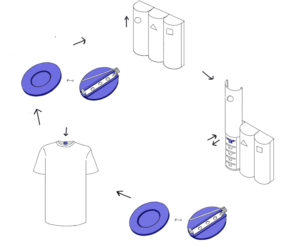
Once the user purchases a new clothing item, they open their wardrobe to put it in with their existing collection. Before hanging the new item, they reach for the product located within the wardrobe. From there, they grab a reusable label and attach it to the new item's tag. This label marks the item as new. With the labeling complete, the user can then hang the new item alongside the rest of their clothing. The labels are designed to be reusable and leave no permanent marks on the items they are placed on.
Once the user purchases a new clothing item, they open their wardrobe to put it in with their existing collection. Before hanging the new item, they reach for the product located within the wardrobe. From there, they grab a reusable label and attach it to the new item's tag. This label marks the item as new. With the labeling complete, the user can then hang the new item alongside the rest of their clothing. The labels are designed to be reusable and leave no permanent marks on the items they are placed on.


Label Container
Label Container
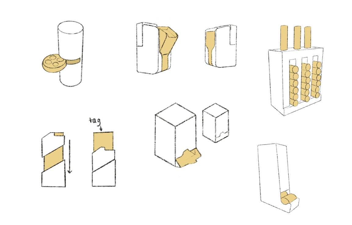
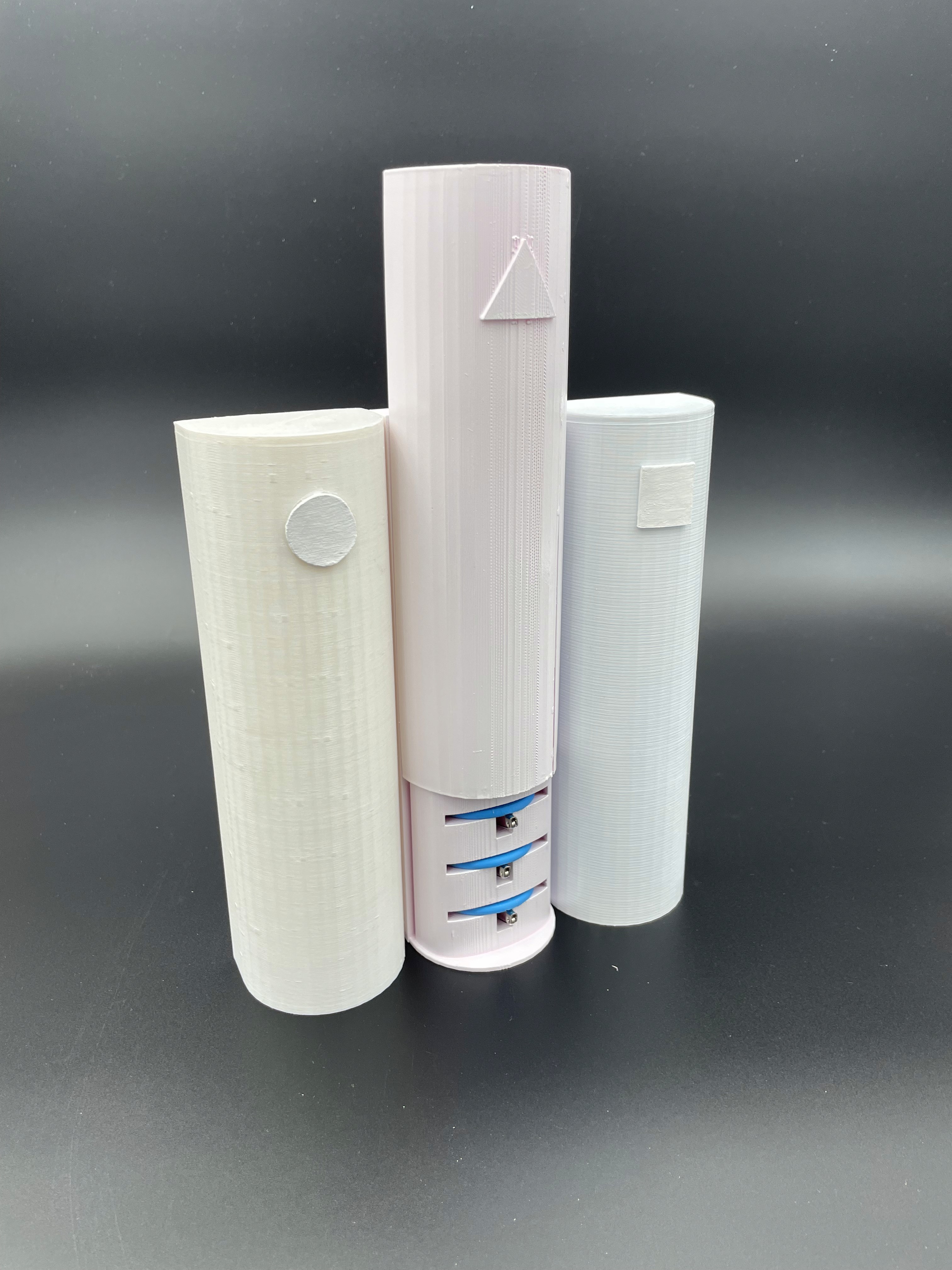
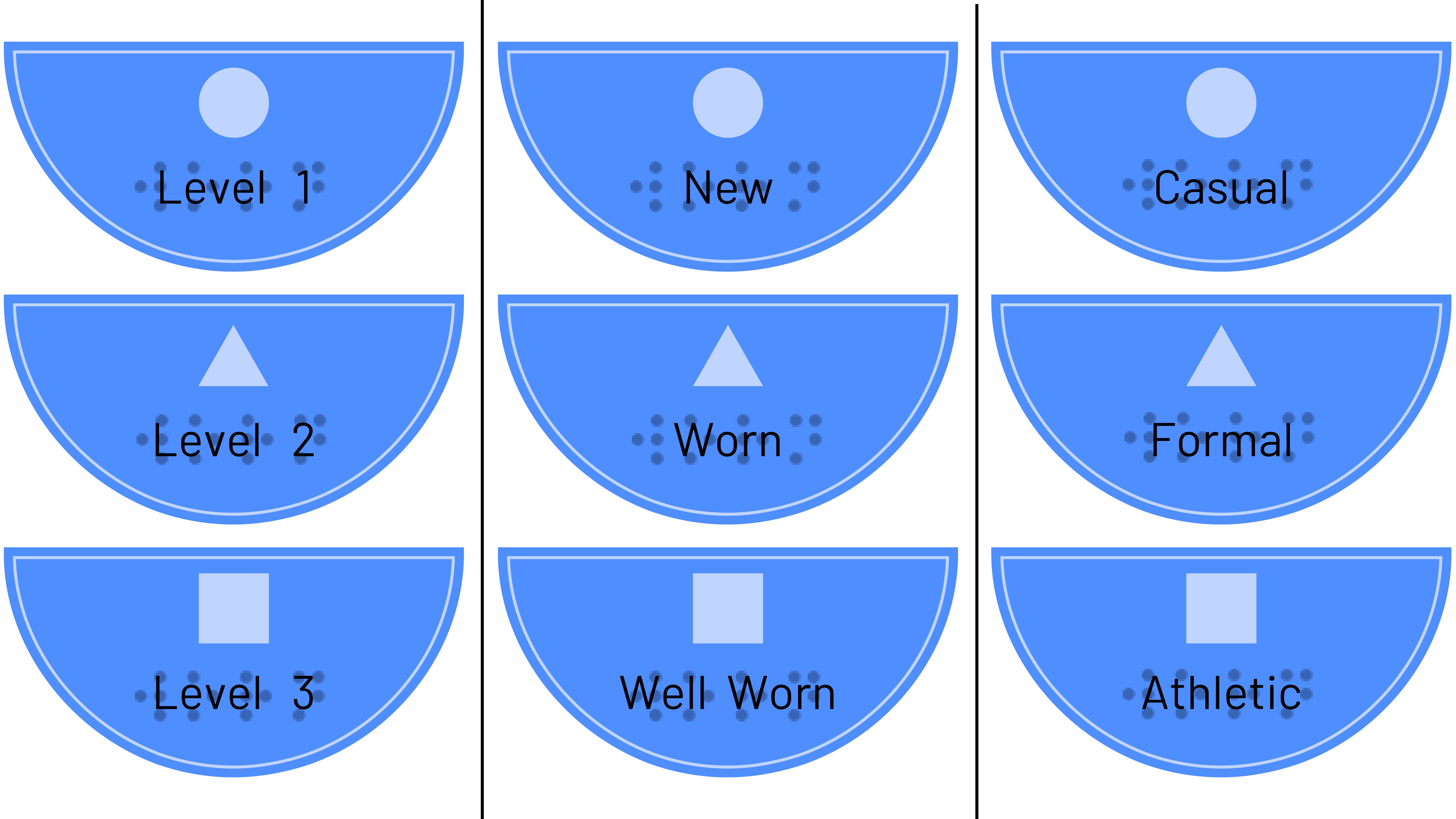
The final design of the container consists of three distinct columns, each representing a different tag. Therefore, the user can easily tell them apart and avoid reaching for the wrong one, as the shape of the container clearly separates all three types. The container has 8 slots per column in which the tags fit perfectly for more order and for easier access for a blind user (it has a better structure/system). There will be a tactile indicator on each column of the container to tell the user what type of tag they are grabbing without having to actually take out one tag to check. It is going to be placed on the wardrobe, most likely on the door, therefore the tags should be secured in the container, which is possible due to the sliding covers on top of each column. This sliding mechanism allows the tags to stay in place while providing a smooth and easy access to the tags. For even more clarification about each tag and each column, at the top of each column there will be a sticker with text in both braille and normal text that will indicate the shape of the tag and what it symbolizes, in this case, the level of newness. Each column is an almost perfect semicircle with a width of 6cm, therefore the final dimensions of this part of the product are 18*20 cm.
The final design of the container consists of three distinct columns, each representing a different tag. Therefore, the user can easily tell them apart and avoid reaching for the wrong one, as the shape of the container clearly separates all three types. The container has 8 slots per column in which the tags fit perfectly for more order and for easier access for a blind user (it has a better structure/system). There will be a tactile indicator on each column of the container to tell the user what type of tag they are grabbing without having to actually take out one tag to check. It is going to be placed on the wardrobe, most likely on the door, therefore the tags should be secured in the container, which is possible due to the sliding covers on top of each column. This sliding mechanism allows the tags to stay in place while providing a smooth and easy access to the tags. For even more clarification about each tag and each column, at the top of each column there will be a sticker with text in both braille and normal text that will indicate the shape of the tag and what it symbolizes, in this case, the level of newness. Each column is an almost perfect semicircle with a width of 6cm, therefore the final dimensions of this part of the product are 18*20 cm.


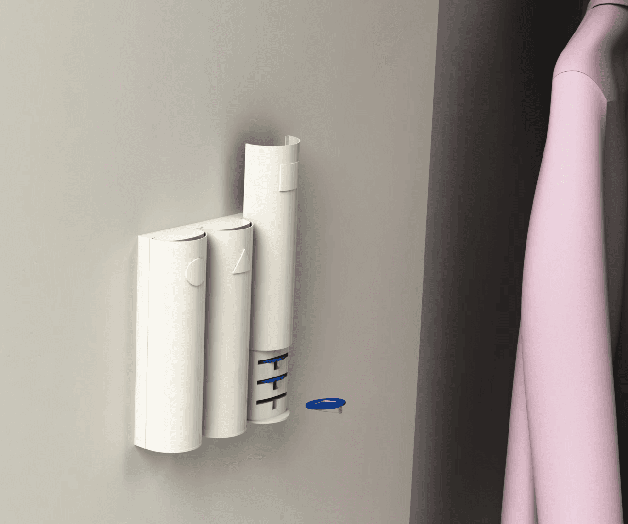
The container can easily be attached to the user’s wardrobe using Damage-Free Adhesive Strips. These strips are designed to eliminate the need for nails, screws, or other hardware that can leave holes or marks on the walls. They provide a strong and versatile hold on various indoor surfaces such as painted walls, cinderblock, and concrete, making them ideal for securing the container in place without causing damage. When it's time to reposition, these adhesive strips can be removed cleanly, leaving behind no sticky residue.

The container can easily be attached to the user’s wardrobe using Damage-Free Adhesive Strips. These strips are designed to eliminate the need for nails, screws, or other hardware that can leave holes or marks on the walls. They provide a strong and versatile hold on various indoor surfaces such as painted walls, cinderblock, and concrete, making them ideal for securing the container in place without causing damage. When it's time to reposition, these adhesive strips can be removed cleanly, leaving behind no sticky residue.

Wall attachment
Wall attachment
Attachment system
This container is designed to blend with the user’s wardrobe and, therefore, it will be designed to be attached to it. For this, several methods were considered.
Attachment system
This container is designed to blend with the user’s wardrobe and, therefore, it will be designed to be attached to it. For this, several methods were considered.


magnetic strips
magnetic strips
velcro straps
velcro straps
Adhesive strips
Adhesive strips
Hooks and clips
Custom slots or compartments
Labels
Labels
Each label serves as a tactile indicator that communicates the recent purchase of an item. When attached to a clothing item, it signifies that the item is new.
The labels can be easily attached and removed from clothing items as needed.
The user can customize the placement of the label on each item based on their preference and comfort.
Each new clothing item will have a special tag or label indicating that it is new. This label will be made of a different texture or material than the regular clothing tag, making it easily distinguishable by touch.
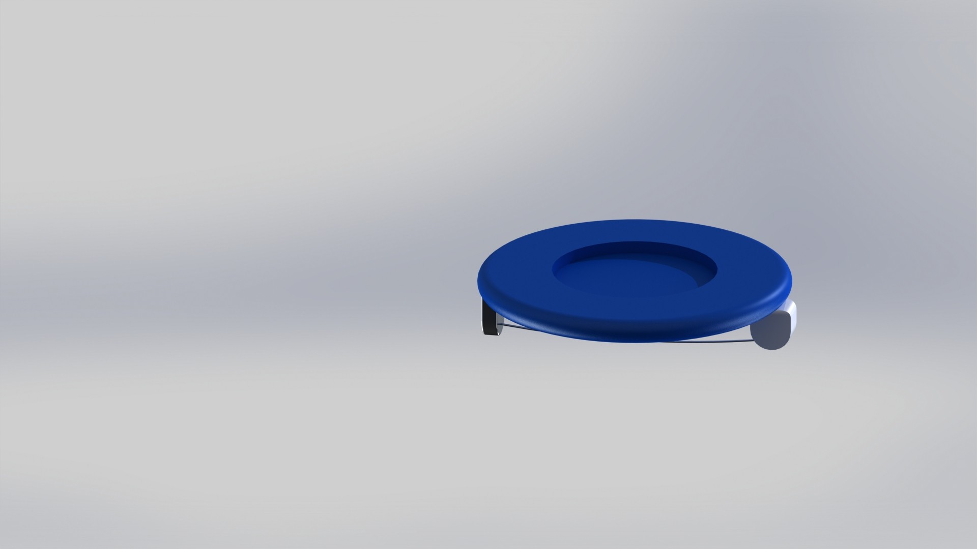
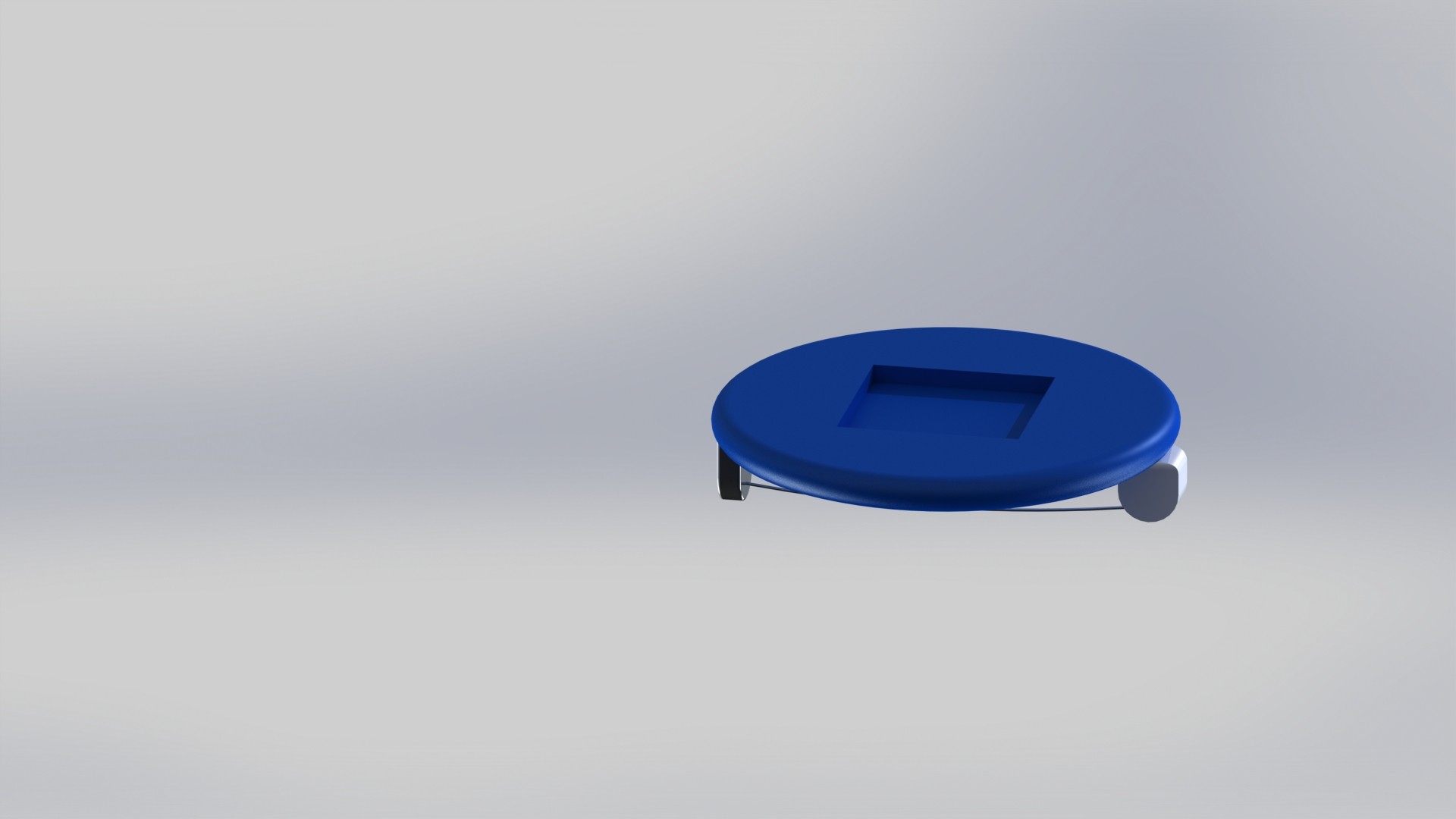
There will be three different tags, each representing a basic geometric shape: circle, triangle and square.
These have a diameter of 3mm and have a brooch-like mechanism attached to them.



Removal and operation
Removal and operation
What each level means.
Level 1: Recently Purchased/New: Attach Level 1 tags to newly purchased items.
Level 2, Moderately Worn: Clothes transition to Level 2 after the Level 1 tag is removed.
Level 3, Well-Worn: Clothes transition to Level 3 after the Level 2 tag is removed.
When to remove each tag.
Level 1: Remove Level 1 tags after the user buys something new.
Level 2: Remove Level 2 tags after the user buys something new.
Level 3: Remove Level 3 tags after the user buys something new.
Removal Time based on New Purchases
Based on continuous interactions and information gathered from Joe, it became clear that basing the removal time of the tags on when he buys new clothes is the most suitable option. In email exchanges, Joe mentioned that he only buys new clothes once a year and is primarily interested in knowing which clothes are the most recent additions to his wardrobe. Additionally, Joe doesn't have many clothes and doesn't buy them frequently. By syncing the removal time of the tags with Joe's buying habits, it ensures that he can easily tell the “freshness” of his clothes based on when he got them. This means Joe can quickly figure out if a shirt was bought this year, last year, or even earlier, without getting into too much detail. This approach respects Joe's preferences and keeps things straightforward while helping him manage his clothing effectively.
Optional Feature - Information Cards
Optional Feature - Information Cards
In the end, we are designing a product for a user, but a more global or market oriented perspective has to be taken into account. How can our product be used by more visually impaired users? We understand that the living situation of each user is quite different and therefore their needs might change, however, their core challenge is common. This product is meant to help blind users identify and differentiate their clothing items, providing them with the information they need to be able to tell them apart. Since we have been designing specifically for Joe, whose main concern was the newness of his clothes, the focus has been on designing a system that communicates to the blind user how new the label is. However, for our product to be able to adapt to several needs it was thought to give our labeling system various uses. This might involve, indicating pattern, color, size, material, etc. instead of newness. Since these three levels or categories are going to be represented and defined each by a particular shape, depending on the context, that particular shape can indicate colour instead of newness, for example.
In the end, we are designing a product for a user, but a more global or market oriented perspective has to be taken into account. How can our product be used by more visually impaired users? We understand that the living situation of each user is quite different and therefore their needs might change, however, their core challenge is common. This product is meant to help blind users identify and differentiate their clothing items, providing them with the information they need to be able to tell them apart. Since we have been designing specifically for Joe, whose main concern was the newness of his clothes, the focus has been on designing a system that communicates to the blind user how new the label is. However, for our product to be able to adapt to several needs it was thought to give our labeling system various uses. This might involve, indicating pattern, color, size, material, etc. instead of newness. Since these three levels or categories are going to be represented and defined each by a particular shape, depending on the context, that particular shape can indicate colour instead of newness, for example.
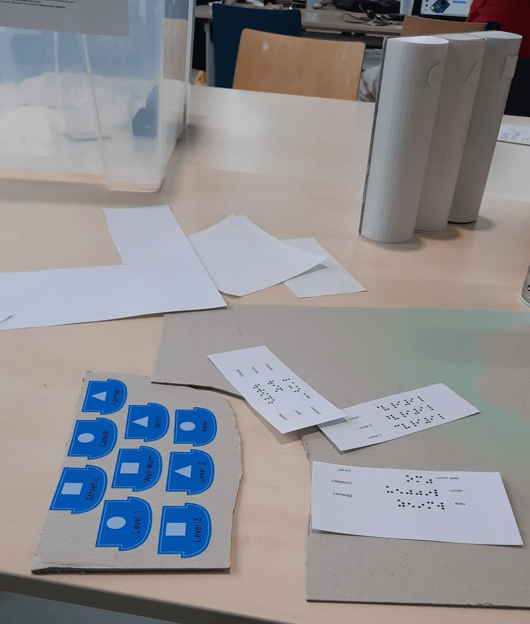

To keep track of all of these possible systems, it was thought to include Guide or Information Cards that serve as a guide for users. These cards would contain the shape of the label and what it represents. An example could be: Circle: Winter Clothes, Square: Summer Clothes, Star: Sports clothes. These cards would have their information on braille and they would be placed on the container, therefore the user can know what each shape means by quickly and comfortably reaching for the container while grabbing the labels.
Heavyweight or thick paper is commonly used for Braille solutions because it provides a sturdy surface that can withstand embossing, which ensures clear and durable Braille characters that are easily readable by touch. It is thicker than normal paper, as it reduces the risk of tearing or distortion during production and allows accurate and consistent reading.

To keep track of all of these possible systems, it was thought to include Guide or Information Cards that serve as a guide for users. These cards would contain the shape of the label and what it represents. An example could be: Circle: Winter Clothes, Square: Summer Clothes, Star: Sports clothes. These cards would have their information on braille and they would be placed on the container, therefore the user can know what each shape means by quickly and comfortably reaching for the container while grabbing the labels.
*insert info card design*
Heavyweight or thick paper is commonly used for Braille solutions because it provides a sturdy surface that can withstand embossing, which ensures clear and durable Braille characters that are easily readable by touch. It is thicker than normal paper, as it reduces the risk of tearing or distortion during production and allows accurate and consistent reading.
Dsu group 3
Q2, 2024
