Prototyping
Here we will explore the final protoype, the fidelity rationle and methods.
Fidelity Rationale
Fidelity Rationale
What is the required fidelity for our final prototype? This system can be made to many different levels of fidelity to represent the prototype. Our main incentive to create a high fidelity protoype is so that we have a final product that can be handed over to our case owner the end. The simplicity of the final concept alows us to reach a level of fidelity that is quite high given the alloted time. Because of this it became clear that the final protoype should be a complete functional representation of the final product.
What is the required fidelity for our final prototype? This system can be made to many different levels of fidelity to represent the prototype. Our main incentive to create a high fidelity protoype is so that we have a final product that can be handed over to our case owner the end. The simplicity of the final concept alows us to reach a level of fidelity that is quite high given the alloted time. Because of this it became clear that the final protoype should be a complete functional representation of the final product.
Prototyping methods
Prototyping methods
There are multiple different prototyping methods that were used and considered.
3d printing: 3d printing is a good prototyping method that allows for high quality, reliability and accuracy. All of these aspects are requirements for a high fidelity prototype and this technique was used by us to produce the majority of our parts.
Foam: Foam is generally a good material for prototyping of visual models, however for our use case, foam was considered to be to porus and delicate to survive daily use.
Metal prototyping: This option was also considered as it can be reliable and strong, however the geometry of our parts did not allow for sheet metal to be used.
Purchasing elements: Purchasing elements of the prototype to allow for rapid development and proof concept is a valuable strategy that can provide easy solutions to parts that would be very hard to prototype. The group utilized this strategy and purchased several different types of attachment mechanisms eventually deciding on the brooch mechanism.
Once the user purchases a new clothing item, they open their wardrobe to put it in with their existing collection. Before hanging the new item, they reach for the product located within the wardrobe. From there, they grab a reusable label and attach it to the new item's tag. This label marks the item as new. With the labeling complete, the user can then hang the new item alongside the rest of their clothing. The labels are designed to be reusable and leave no permanent marks on the items they are placed on.


Final prototype
Final prototype
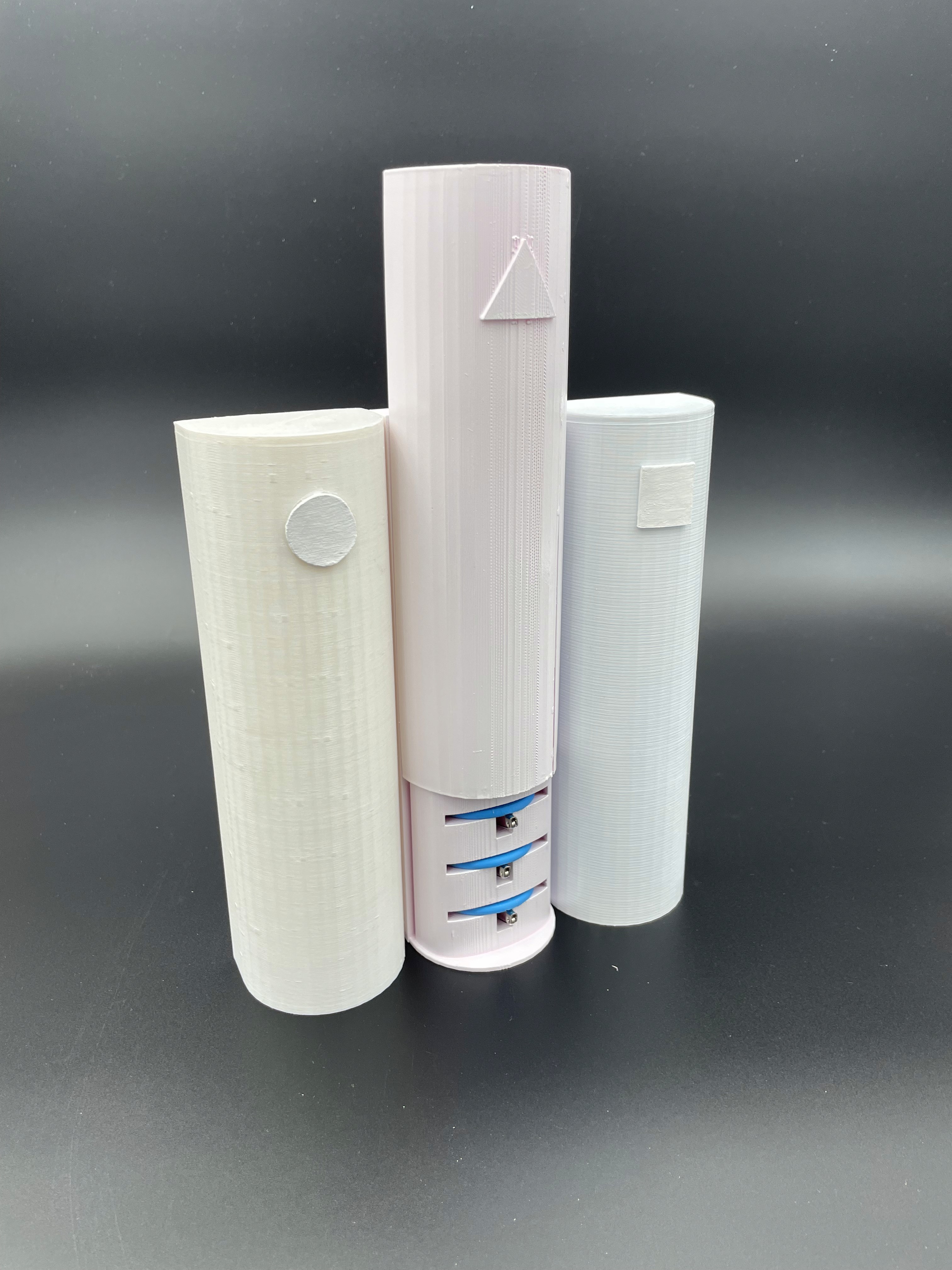
The prototype effectively demonstrates both functionality and aesthetics, providing an accurate preview of the final product.
The prototype includes three columns in a container. One column functions perfectly, showing how the system would work in real life, as the user is able to slide open the container and grab the labels stored in it. Due to time and material limitations, the other two columns are mock-ups—they look like the final product but don't actually work. They enhance the product's visual appeal, but do not show the functional aspects of the product. Therefore, this prototype, without being entirely functional, communicates the product’s use, purpose and possible interactions.
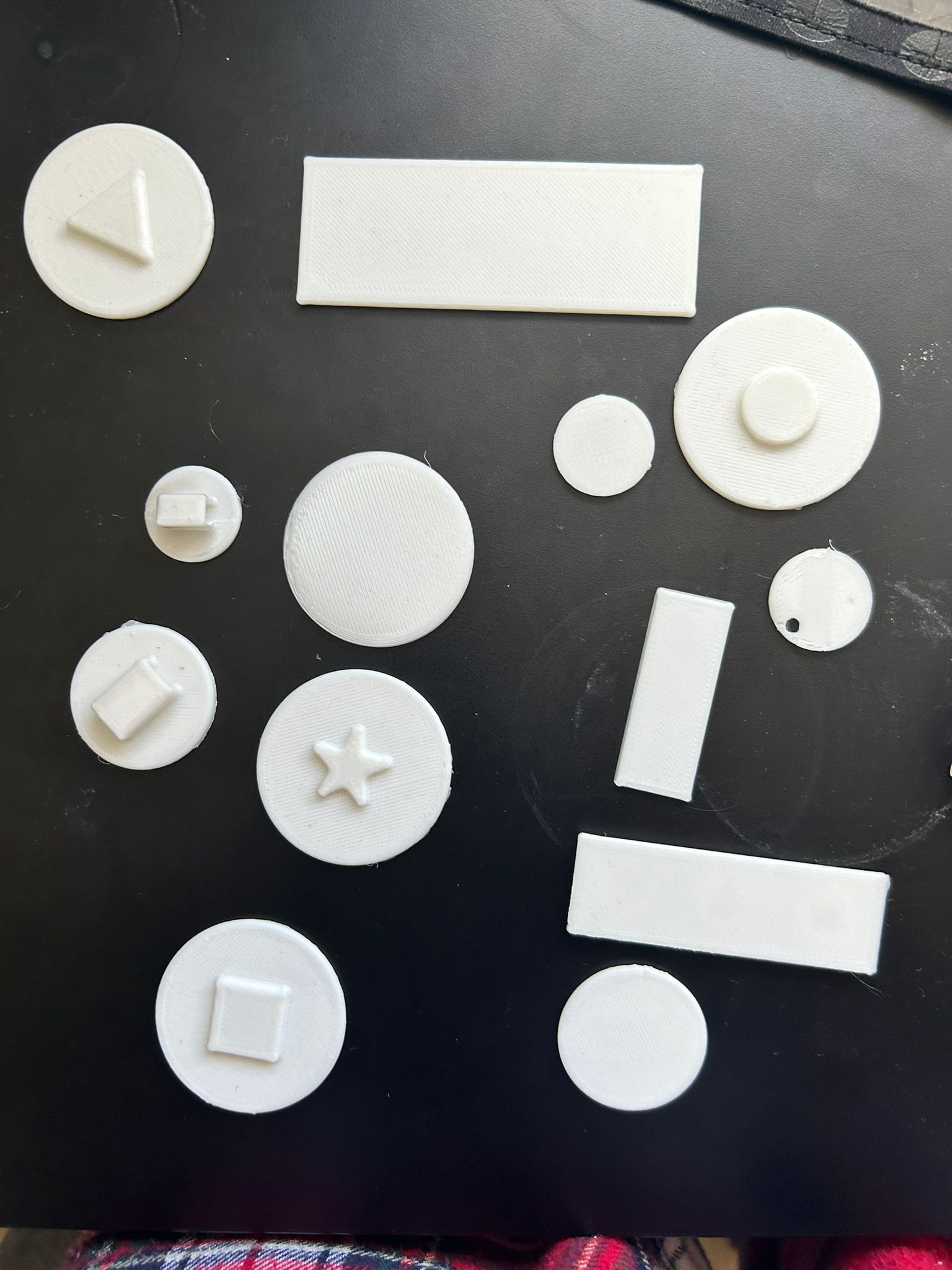
The tags on the prototype are functional but slightly larger than intended due to resource limitations. Despite this, they show how the labeling concept would work practically.
Overall, it combines functionality with an accurate physical appearance, providing a clear idea of what the final product will offer. Though not yet fully functional or visually perfect, it's an important step forward in development.

Discrepancies
Discrepancies
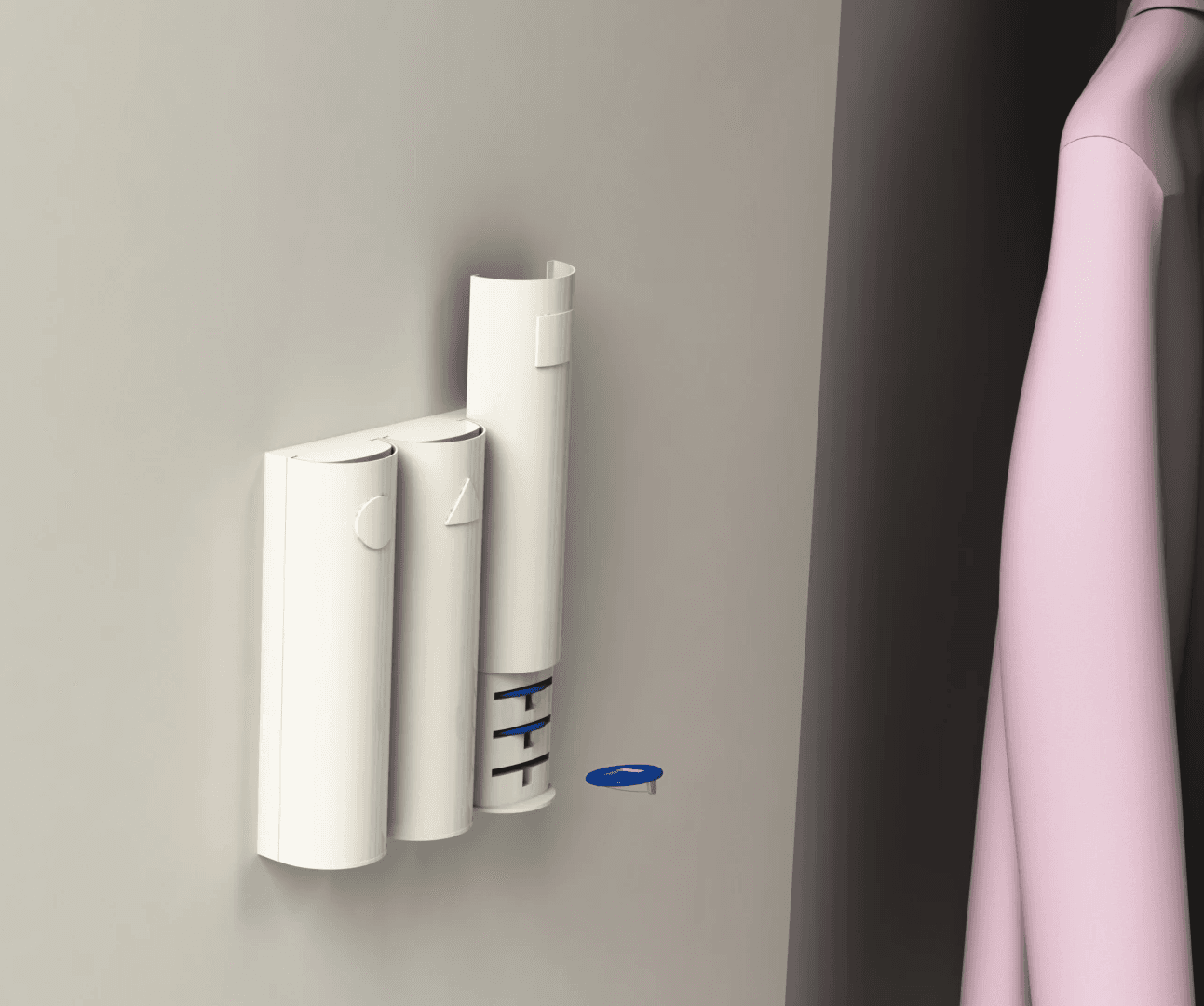
The prototype tags became a bit bigger than the real final design in the end. This is due to the available brooches sizes in the shop, the smallest available was 40 millimeters. Therefore the diameter of the tags also became 40 millimeters, instead of the 30 millimeters of the final product. In the end the decision was made to create a cut out for the sign instead of an embossed sign such that the sliding in the container would be easier. By this decision the thickness of the tag also became a bit bigger, 4 millimeters, to make sure the tags still will be strong enough. On the backside there is a slot where the attachment of the brooch will fall into, the total tag with brooch is around 10 millimeters. This is the same for the final product.
The container consists of 8 tags which determine the height. Above the slots there is a little extension such that the sliding part can stay stably up when the container is opened. The total height ends up in 20 centimeters in total, for both the prototype and the final product. The slots for the tags are a little less deep than the diameter of the tag such that tags will stick out a little to grab them more easily, a difference of 15%. To make sure the tags are not in the way for the sliding mechanism there is some space between the sliding part and the container itself. Also are the slots tilted backward a bit to make sure the tags would not fall out. The width of the slots for the prototype are a bit bigger than the final product of course, here a tolerance of 10% to the tags is kept. The half cylinder on the front of the container has a diameter of 60 millimeters. For the better assembly to other containers on the side the rectangle back is 62 millimeters. The deepness of the total container is 75 millimeters, these outer dimensions are the same for the prototype and final product.
On the front of the container is the sign of the tags inside such that the user knows which ones are inside. On top of the container is an info card placed by the user, which is a sticker with text and braille on it. By this the blind user and maybe a helping person both know what the sign on the tags means. In the prototype the text is in english because of the international people during the market, the braille is in dutch because our participant only knows the dutch version of braille. The user can connect the final product to a door or wall by a removable sticking sticker. This was only not included in the prototype.
Dsu group 3
Q2, 2024
