Co-design
Here we will discuss the Co-design process.
Full interview transcript
Introduciton
Introduciton
Co-design sessions empower the user’s role in the design process. They are the experts of their own life, they know themself the best. So, it is reasonable to do collaborative brainstorming sessions to empower the influence of the users.
Co-design sessions empower the user’s role in the design process. They are the experts of their own life, they know themself the best. So, it is reasonable to do collaborative brainstorming sessions to empower the influence of the users.
General plan for Co-design
General plan for Co-design
Start with small talk
Discuss expectations: what we want out of this session. explain what codesign is.
Walk around his house
Present concept 1: NFC tags + feedback
Present concept 2: AI camera + feedback
Present concept 3: braille tags + feedback
Any other things he would like to see back in the product?
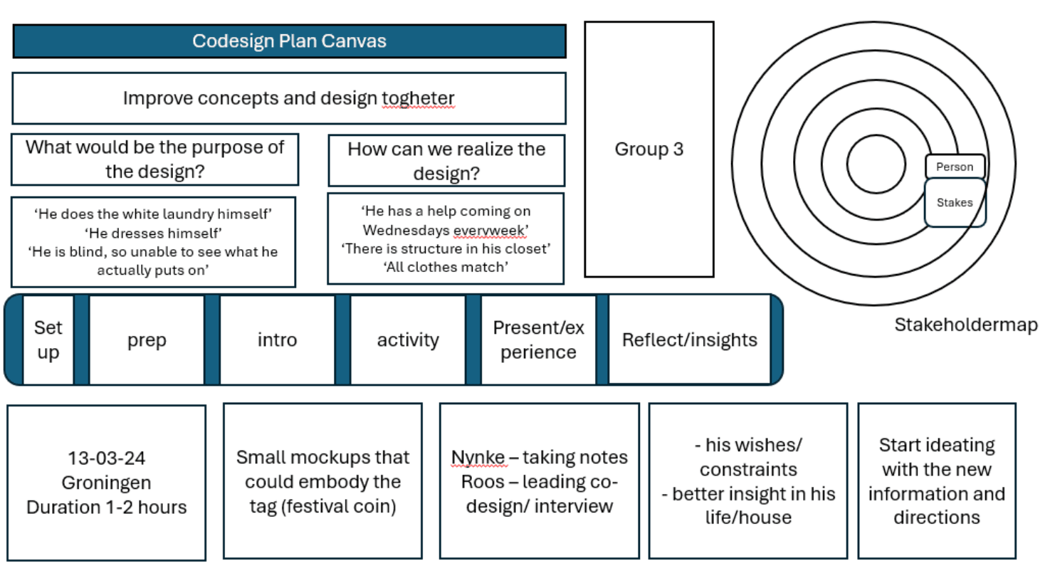

In creating the clothing identification solution, the focus was on ensuring that the product aligns with the everyday experiences and needs of the visually impaired participant. The user was recognized as the expert of their own life, aiming to empower them throughout the design process. Through collaborative sessions, efforts were made to anticipate future needs and challenges, ensuring the product remains relevant over time. By valuing the user's input and expertise, a solution tailored to their requirements was crafted, fostering a sense of ownership and empowerment.
In creating the clothing identification solution, the focus was on ensuring that the product aligns with the everyday experiences and needs of the visually impaired participant. The user was recognized as the expert of their own life, aiming to empower them throughout the design process. Through collaborative sessions, efforts were made to anticipate future needs and challenges, ensuring the product remains relevant over time. By valuing the user's input and expertise, a solution tailored to their requirements was crafted, fostering a sense of ownership and empowerment.
Methods
Methods
We have considered a lot of different co-design methods to use in our project. However, due to the fact that our participant is blind, it can be tough to co-design given the techniques shown to us during the lectures. So we had to choose the most suitable for our project and from what we have seen the most useful techniques were ‘a day in the life’, ‘home safari’ and ‘working with mockups’.
We have considered a lot of different co-design methods to use in our project. However, due to the fact that our participant is blind, it can be tough to co-design given the techniques shown to us during the lectures. So we had to choose the most suitable for our project and from what we have seen the most useful techniques were ‘a day in the life’, ‘home safari’ and ‘working with mockups’.
A day in the life
During the co-design session, we discussed the activities he does during the day and throughout the week. Furthermore, he was able to show us his home. How he has structured methods and tricks in there for him to live effectively. Typical things he does in a day are listening to the radio, doing groceries and going out for dinner to a mensa as he does not like to cook. Activities outside his home require some assistance from the people around him. For example, when doing groceries, he goes to the reception and asks for an employee to help him grab the right products.
An object that is often involved in his outside activities is his cane. He uses this to feel his surroundings. For instance, to feel the stairs or where the curb ends. However, mostly he has it for the surrounding people to show that he is visually impaired and to take into account that he does not see them.
When asked about it, he does not feel that things in his life go wrong or that he cannot do things. This is because over all these years he has learned to be self-dependent and do things in a way he is able to.


Home safari
A walk through his house gave insight into his home and to all the adaptations he has made to live independently.
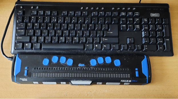
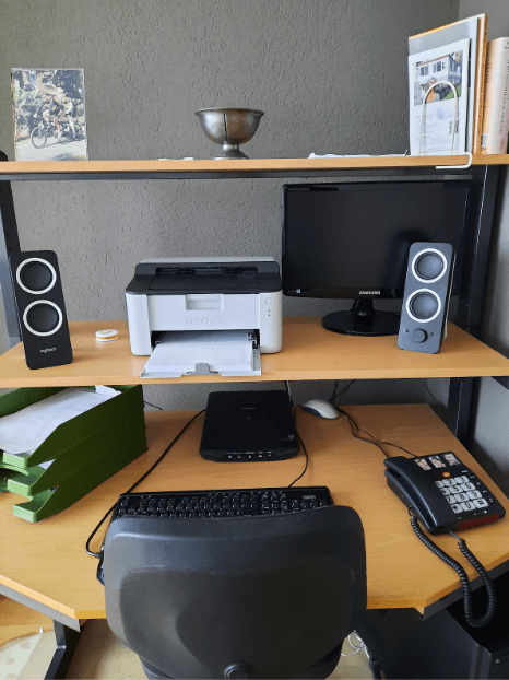
The biggest difference is his desk. He has a braille board where he can feel the text he typed. He uses a normal keyboard to type and checks himself with the braille board. He has speakers and a system that reads all the text on the screen out loud. He does have a screen but he does not use it as he cannot see it.


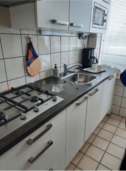
In his kitchen, he made up a system for his dishes. He has a tray where he puts his dishes so there is a designated place. However, he reasoned that he does not want to do his dishes multiple times a day and just collects them tod o it at the end of the day.
In his kitchen, he made up a system for his dishes. He has a tray where he puts his dishes so there is a designated place. However, he reasoned that he does not want to do his dishes multiple times a day and just collects them tod o it at the end of the day.

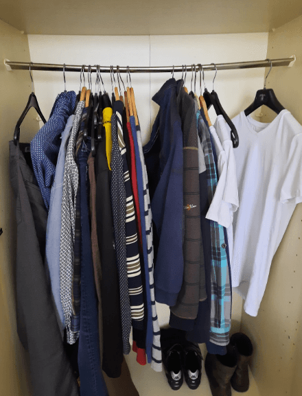
His wardrobe is organised with a system too. He has his clean clothes at the right of his cycling clothing and he puts his dirty clothes on the left on them. Doing so he has a divider and he can easily feel the difference. His domestic help takes the dirty clothes and washes them. They do the colour washing and he does the white ones himself.
His wardrobe is organised with a system too. He has his clean clothes at the right of his cycling clothing and he puts his dirty clothes on the left on them. Doing so he has a divider and he can easily feel the difference. His domestic help takes the dirty clothes and washes them. They do the colour washing and he does the white ones himself.

Working with mock ups
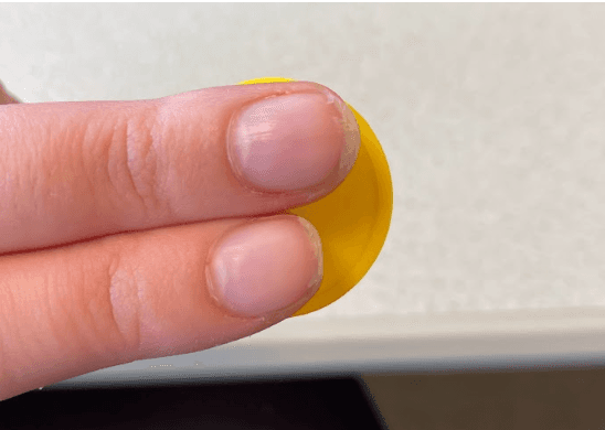
In being able to let our participant already get a feeling for what the product could be we brought and showed him tiny pieces that could embody the prototype. We used a plastic coin, of approximately 2 cm width. This way he could feel the product and see if he found it suitable for the size and feel of the tag. We also talked over different options for material and attachment methods to see how we could design this product the best to his needs. Nice examples that we came up with were the use of safety pins or velcro.
In being able to let our participant already get a feeling for what the product could be we brought and showed him tiny pieces that could embody the prototype. We used a plastic coin, of approximately 2 cm width. This way he could feel the product and see if he found it suitable for the size and feel of the tag. We also talked over different options for material and attachment methods to see how we could design this product the best to his needs. Nice examples that we came up with were the use of safety pins or velcro.

Conclusion
Conclusion
After conducting the co-design session, the main findings were the tags should be placed on the clothing, not on the hanger, more specifically, on the collar and for trousers around the waistband. The purpose of the tags is to indicate how new his clothes are. The look of the clothes does not matter to him, due to the fact that he has help from his friends or family during shopping and they make sure all his clothes fit together. He only goes shopping once a year, so three levels were fine for him to indicate the different stages of his clothes. Moreover, the material of the tags should be nonirritating such as soft plastic or rubber. Furthermore, he would like to get the information from the tags by touch, so no hearing indication. Moreover, braille was not his preference, visuals like icons were nicer to indicate newness. Some different possibilities for attaching the tags were a safety pin, velcro, magnets, and regular clips.
Other insights were his routine and how he manages to do things at home by himself, for instance how he uses the computer.
Dsu group 3
Q2, 2024
